eBird Abundance Maps

What are Abundance Maps?
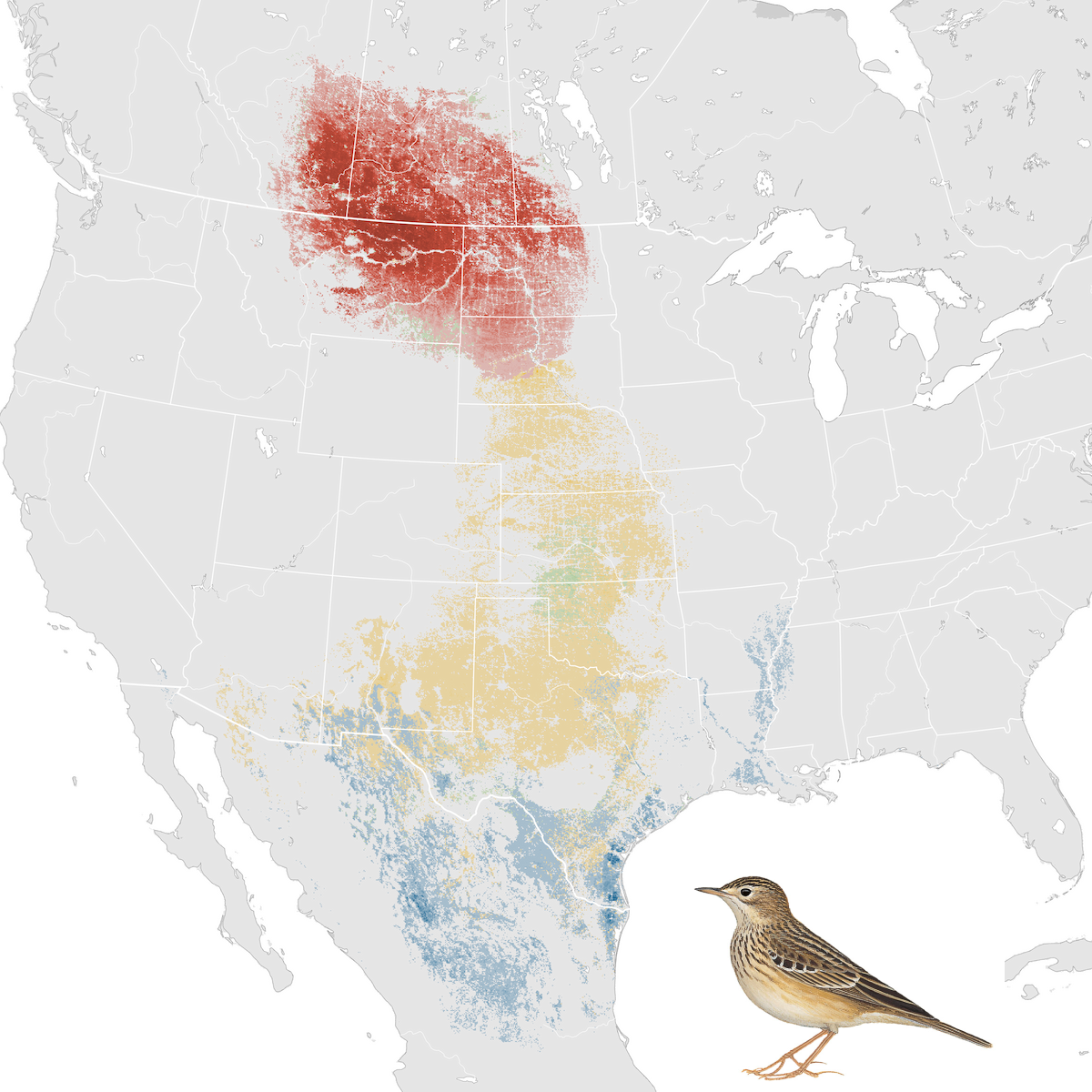
Abundance maps illustrate the relative abundance patterns of bird species throughout the year. For example, this information includes where a bird breeds, migrates, winters, or stays year-round. Abundance maps can be viewed for a bird’s full annual life cycle or for a specific season. “Relative abundance” is defined by eBird as the count of individual birds of a given species listed on an eBird checklist travelling 1 kilometer for at least one hour. On eBird abundance maps, darker colors show a higher relative abundance of a bird species. Red shows a bird’s breeding grounds, blue its non-breeding grounds, yellow its migratory stop-over areas, and purple its year-round locations.
Abundance Maps and Land Trusts
Abundance maps are a visual tool for land trusts to identify which species they should target on their properties and easements and strategize ways to manage lands to help reverse bird declines and improve habitat quality. For example, abundance maps have helped land managers discover that the Sprague’s Pipit, a grassland bird with rapidly declining populations, is impacted by road density in addition to non-native grasses and poor rangeland management because they have lower abundance in areas near roads. For a land trust, this shows which areas could be protected, what type of land management could be implemented, and creates a story that could help them fundraise and apply for grants. Land trusts can also find ways to engage their community in stewardship projects around the Sprague’s Pipit, such as non-native plant removal or sustainable rangeland management practices.
Access the tool here to explore ways to protect your land for bird conservation.


