Powered by Data from eBird and NASA, These Maps Are a Game-Changer for Conservation
MORE ABOUT THIS TOPIC
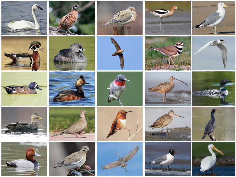


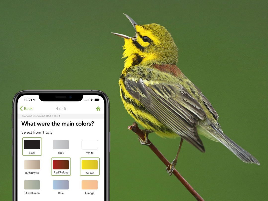
In December 2018, the Cornell Lab of Ornithology released the first in a series of new maps, charts, and data resources that reveal unprecedented details about not just where birds are, but how their numbers and habitats change through the seasons and years.
Unlocking this wealth of information required more than 114 years of cloud computing time, provided by Amazon Web Services, to process observations recorded in eBird by more than 120,000 bird watchers across North America, along with satellite imagery from NASA.
The result: a captivating, data-driven portrait of the changing movements and numbers of birds—showing the full sweep of birds across the entire continent down to your own neighborhood.
The new data-driven maps and visualizations, called “eBird Status and Trends,” are powerful new tools for science and conservation, realizing the original vision for eBird to monitor the health of bird populations across the continent in near real time.
Maps and additional data-driven visualizations for 107 bird species are available and free to download, with more regions and species to come, thanks to support from the National Science Foundation, Wolf Creek Charitable Foundation, Leon Levy Foundation, NASA, Amazon Web Services, Institute for Computational Sustainability, and supporters of the Cornell Lab of Ornithology.
More Stories
 Conservation SciencePowering a New Era of Conservation
 EducationAny Person, Any Study, Any Vision
 K–12 EducationInspiration and Activation
 MerlinThe Magic of Merlin
 Bird AcademyA Conversation with Our Director
 Coastal SolutionsRevitalizing the Pacific Flyway
 Conservation MediaAmerica’s Imperiled Arctic Wilderness
 Conservation in ActionIf This Reef Could Talk
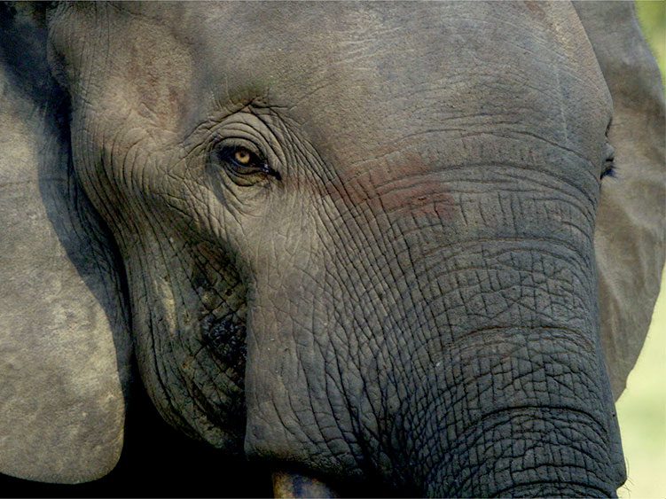 Conservation in ActionHow We Use Sound to Help Protect Elephants from Poaching
Join Our Email List
The Cornell Lab will send you updates about birds, birding, and opportunities to help bird conservation. Sign up for email and don’t miss a thing!
Golden-cheeked Warbler by Bryan Calk/Macaulay Library